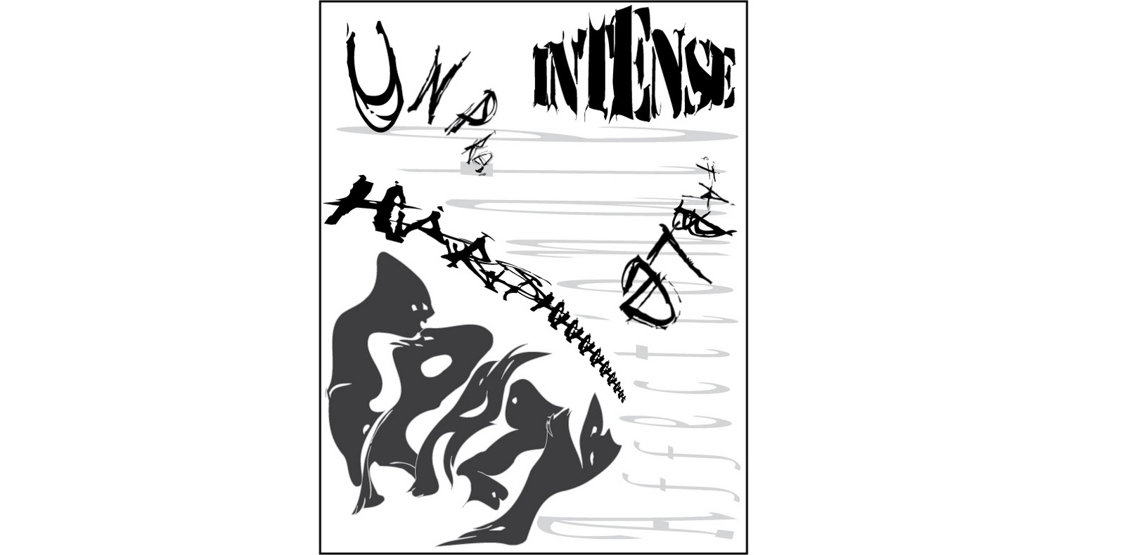
For my designs on project number 3 I tried to intergrate different shapes, forms, values, and colors to each of my five describing words to try and make the words "come to life" and give a visual description of what each word means. The five different describing words i had were unpredictable, crazy, harsh, affectionate, and intense. For my color and black and white design i tried to give each word "feeling" based on its definition.
For my color variation of my design, i tried to impliment a different type of "feel" for each one of the characterisic words i chose for myself. For the word unpredictable, i chose to cut the word in half and place it on two different sides of the design so it would appear to be "unpredictable". I also chose to have a blue grading as the letters went further on in the word the blue would be a lighter tone. For the word harsh, i chose to emphasize the h on the word so i gave it multiple h's instead of just one. I also used a type of font which would make the word appear "harsh" and i didnt change the color of it and i instead kept it black so it appeared to be the most "harsh" word on the design. For the word crazy, i chose to use the warp tool on adobe illustrator to make the word look "crazy" in appearence, and i also gave in a rainbow color to have it look like it was all over the place. I also wanted it to be the biggest word on the design because i believe that is my most profound characteristic and the describing word that stood out the most. For affectionate, i gave it a lighter tone of pinks because i believe the word affectionate is of lite, feminine desent. I made affectionate appear that it was attaching itself to the rest of the describing words to make it look "affectionate". For the final word i had (intense), i used a military type font to have it stand out abit more, and i also changed the font for everyone of the letters in intense to make it abit more "fisheye". I gave it an "intense" bright green to also make it stand out more.
For every one of the words i used, I tried to give them something each alittle bit different to make them stand out amongst each other in the design, but i also had to take into consideration that each word had to play off one another to let the design work as a whole. I tried to balance each work throughout the design so not one space would be too full or too empty, i also chose the proximity of the words to be closer or farther away from one another to have the design not seem so crowded. I proportioned and scaled the words as such that they would each have their own type of "mood" and they would work together in the art project. I used repetition on the word harsh to emphasize the shhh at the end of the word. I used variations in font, color, shape, and form on all of the words to make them each stand out among one another. I believe i have done a good job trying to put emphasis, scale, proportion, balance, unity, repetition, variation, and proximity into play in my design, and each design principle is used well in my project.